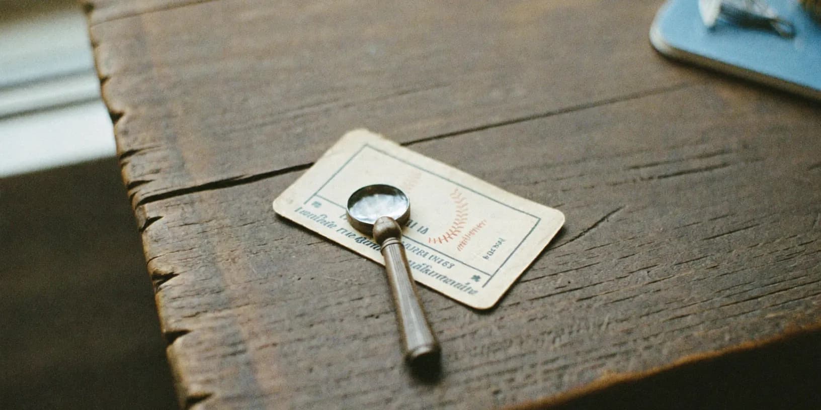
Every printing technology leaves fingerprints. A card printed on a 1950s offset press looks fundamentally different under magnification from a 1990s reprint of the same image, because the presses, the screens, and the inks all changed decade by decade. That difference is invisible at arm's length and unmistakable at 10x — which makes a cheap loupe one of the highest-value tools a card collector can own.
This matters because era is where vintage card value lives. A 1952 card reprinted in 1991 might look identical in a photo listing, and plenty of sellers — some innocently, some not — describe reprints with language that never quite says "original." The print surface settles the question in about thirty seconds, without an authentication fee, and without taking anyone's word for anything.
Why print dots give the era away
Almost every card ever mass-produced was printed with some form of halftone process: the image is built from a pattern of tiny ink dots that blend into continuous color at viewing distance. What changed over the decades is how those dots were made. Mid-century offset lithography used coarse mechanical screens, so a 1950s card shows large, loose clusters of dots — printers call the circular cluster pattern a rosette — with visible gaps between them. By the 1980s, screens had tightened dramatically, and the rosettes shrank. Modern digital printing produces dots so fine and so uniform that the pattern barely resembles the vintage look at all.
The ink itself tells a parallel story. Period four-color printing laid cyan, magenta, yellow, and black down in separate passes, and under magnification you can see the colors sitting beside each other rather than blending — slightly misaligned passes are common on genuine vintage cards and are actually reassuring to see. A modern reprint of that same card, produced from a scan, tends to show smoother blends, sharper edges, and a suspicious perfection that the original press could never have achieved.
So when a seller says "1957" and the dots say "laser-sharp uniform grid," you have your answer. The printing can never be older than its technology.
How to examine a card in practice
You need magnification somewhere between 10x and 30x — a jeweler's loupe, a cheap USB microscope, or even a phone macro lens will do. Pick a light-colored area of the card to examine, because screen structure shows best in pale zones: borders, sky, skin tones. Dark saturated areas flood with ink and hide the pattern.
Look first at the overall dot character. Are the dots slightly soft and irregular, with visible rosette clusters and breathing room between them? That is consistent with vintage production. Are they crisp, tiny, and perfectly even? That is a modern print, whatever the card claims to be. Then check a printed black area against a genuine shadow: vintage blacks are often built from layered color and look slightly "warm" up close, while modern blacks can be a flat, single-pass ink.
Finally, photograph what you see. One sharp macro frame of the border region, taken with a single hard light source at a low angle, records the evidence permanently. Attach that photo to the card's entry in your catalog and the analysis travels with the card — you'll never need to re-examine it to answer a buyer's question, and a future sale inherits the documentation.
What the dots can and cannot tell you
Print analysis dates the printing. It does not, by itself, authenticate the card. A period-correct card can still have problems the loupe won't flag as fake: trimmed edges to sharpen corners, recolored borders, rebuilt surfaces. Those alterations happen to genuinely old cardboard, which is exactly why they fool people.
Treat the dot pattern as one strong signal in a set. Card stock thickness and feel, gloss level, the way the card fluoresces under UV light, and — above all — provenance each add their own evidence. A card with the right dots, the right stock, and a paper trail back to a 1960s shoebox is about as safe as vintage gets. A card with the right dots and a story that keeps changing is still a risk.
A worked example
Say you're offered a "1957 Topps" card at a flea market for a price that's either a bargain or a trap. Under the loupe, the borders show fine, perfectly regular dots with no rosette structure, and the back — which should be a coarse single-color print — has the same modern uniformity. Total examination time: under a minute. However charming the vendor, that card was printed within the last few decades. Now reverse it: loose rosettes, slightly misregistered color passes, a matte back with period-appropriate coarse text. The card has cleared its first and most important hurdle, and the conversation about price can continue seriously.
The loupe doesn't make you cynical. It makes you free to be enthusiastic, because your enthusiasm has evidence under it. Record what you find, keep the macro photo with the card's entry, and every future decision about that card starts from facts instead of memory.